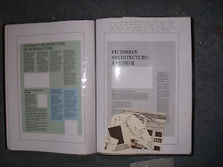
This week my work was due to be handed in!
After several late nights and some frustrating times adapting and tweaking my work, I'm happy with my end result, and think I've mostly achieved what I set out to.
If I could go back and spend a bit longer, I would spend more time considering paper stock and printing techniques to get a really professional finish.
The aspect I'm most pleased with however is the hand drawn images. I think they add another dimension and some much needed character to a topic that could easily produce a monotonous set of layouts!
Sexty Towers
Monday, 7 May 2012
Monday, 16 April 2012
Week 25
After a break for easter, I arrived back having came up with layouts for my front cover (based on relating to my previous work), and I'd produced full size ink sketches to use in my final pieces.
I then scanned these into the computer and removed the backgrounds. I'm really pleased with the sketchy, but professional look I think I've maintained in the drawings.
I'd also spent time further developing my previous spreads to a point where they were nearly completed, and ready to add the images to.
Wednesday, 28 March 2012
Week 24
I'm now fairly confident with the laying out of my text, grid structure, and colours for my DPS, and although I will continue to make changes, I wanted to think about the content. I produced some rough sketches, and printed out my article full size, so I could get a closer look and make sure my text was at the right size and that the layout worked blown up to 100%.
I continued work on the layouts as the week progressed, adding photos, and sketching my images in roughly to see how they would work.
Tuesday, 20 March 2012
Week 23
I came up with another design for the Carbuncles article, and finally produced two final thumbnails for both DPS's. The decisions I made were based on my own opinions of which aspects of the designs worked well, and also from the feedback I received. I have tried to keep the two designs related to each other, and made some clear links in the positioning and size of content as well as the layout and grid structure.
I then made a start on taking my layout into the Adobe Indesign programme.
I'd previously already looked at fonts, but made a final decision and started to tackle the problems with laying out the text in an organised, legible manor.
Wednesday, 14 March 2012
Week 21 + 22
During week 21, we were given a study week, as some members the class were away visiting New York.
I'd already started working on thumbnail sketches for my Architecture News page, and continued to work on coming up with design solutions.
Based on what I'd seen in other mags and my own original ideas, I'm trying to produce a design that keeps each article separate whilst also linking them together. Another consideration is hierarchy, and deciding which article should be given the most prominence.
Colour coding, size, positioning and numbering are all ways I've considered.
In our next session in week 22, I received feedback on my thumbnails, both from my peers and lecturers. I created some more designs based on this feedback, and decided on my strongest layout, reproducing and tweaking it along the way.
I then started to think about my "Hooray for Carbuncles" DPS, and how I could relate it to the Architecture News spread.
Monday, 27 February 2012
Week 20
After gaining what I feel is a good understanding of the topics in the articles, I wanted to spend some time studying similar magazines, to get a feel of what the project required and the type of target audience I need my project to associate with.
I spent some time in the University library looking at past and present editions of popular architecture magazines, analysing the Typography, grid structures, colours, paper stocks, and other interesting features.
I can hopefully use this to influence my layouts.


Monday, 20 February 2012
Week 18 +19
I wanted to really get to terms with the subjects in the articles, to give me the best chance of coming up with relevant content and a design I could be pleased with.
I spent a lot of time looking into the Brutalist theme, exploring the history, and looking at photos of brutalist structures, as well as artwork that is influenced by the style. I wanted to feel like I fully understood what the article was referring to before I started to produce design solutions.
The same goes for Victorian and Georgian architecture. Although there isn't as much emphasis on these topics, I felt it was important to get a good knowledge of the themes.
Subscribe to:
Posts (Atom)


